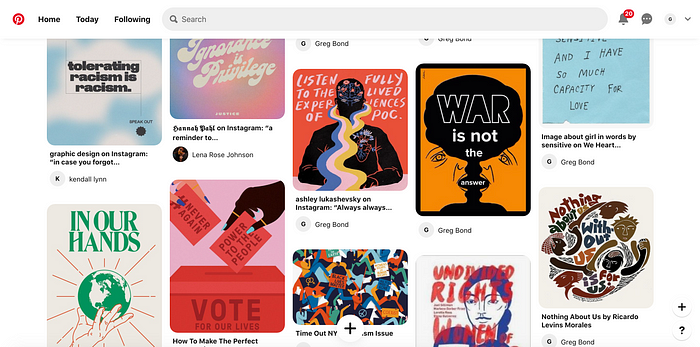
When James first gave our design group this assignment, we can honestly say that any of us knew what the Impact & Empathy project was, nor what our final product was going to look like in the slightest. Nonetheless, our group trusted the process, and started to dive headfirst into Hyperakt, a website James showed us to find inspiration for our projects. After a lot of sifting, we landed on two projects that resonated with us — the GOOD Wellness Project, and Spotify’s Encouraging Meaningful Impact. We largely enjoyed these two projects due to their use of vibrant colors, and we also liked that both projects utilized design to make people care about their respective subjects, nutrition and community engagement. Ultimately, we decided to lean towards the aesthetics of Spotify’s project, and began moodboarding away, picking things up from Pinterest, Instagram, past projects, and more.
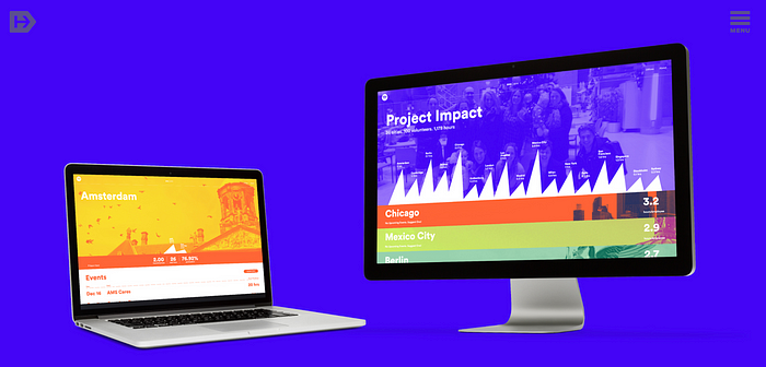
Once we looked at all of our inspirations together, we realized that our moodboards, and our chosen Hyperakt project, all related to each other — they all focused on bringing attention to current events. It all became clear: we would center our project around bringing awareness to any and every event that was important to us. Climate change, social justice, human rights, you name it, we planned to cover it. (Little did we know this was way too ambitious and was going to need further refinement).
Once we pitched our idea to James, he told us that it was a little ambitious and needed a little more refinement (lol). As we left this feedback session, we made a plan to each think of 3 specific topics we cared deeply about that we could bring to the following week’s PechaKucha presentation. Before our we could build our presentation; however, inspiration hit Eme & Kendall. We realized that we all had too many areas of social justice we were passionate about to narrow it down. We started thinking about the weight that we’re carrying at this point in our lives: so many different areas of social justice to think about, topics to be educated on, ways to be active citizens and participate in our government, all while the world is quite literally burning around us. We thought about how we’re stepping up to the plate at a time where it’s essential to hit it out of the park — but we’ve never played baseball.
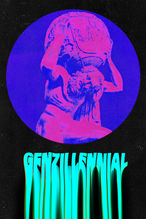
With this newfound epiphany, we created our PechaKucha presentation surrounding the idea of “Gen Zillenial” carrying the world on our shoulders, and looking back at ancient tales from all over the world to potentially find clarity in our futures. After our presentation (which definitely accidentally ran over the 6 minute 40 second time limit…), we got to work on some iterations.
Lena Rose Process
After discussing the parallels between the struggles of “GenZillinnial” and classic storytelling motifs used throughout human history, I immediately found inspiration in classic Greek mythology. My first few iterations included iconography such as Atlas, Medusa, and Hermes. However, after only a few posters were finished, I was already noticing a sort of burn out.
In order to fend off potential art block, I zoomed way out in my own process. I started experimenting with warped images, liquifying pixels and smudging them around the screen to create a sense of tension and unease in this uncertain digital age. I magnified, stretched, cropped, distorted, compressed, saturated, and reinvented. It was through this process of iterating and reiterating that I found a strong visual language in my first twenty-five compositions.
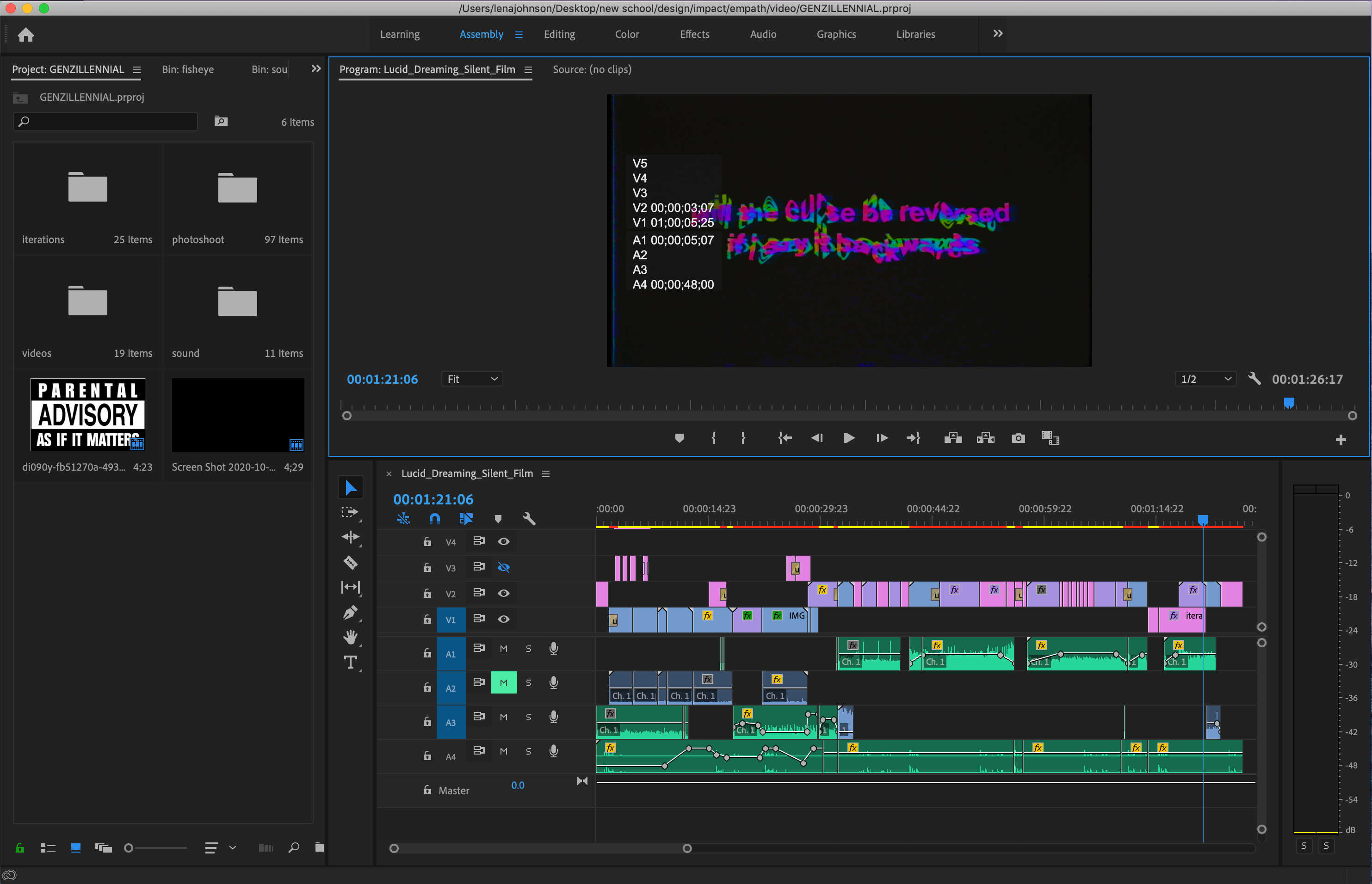
Once the still layouts were completed, each member of our team was faced with a new challenge: find a way to present our work digitally or via analogue methods. Coming from a film background, I chose to allow my work to remain in the virtual world of RGB colors. I started gathering all my posters and trying to sequence them into a video that would both communicate the struggles of GenZillinnials and portray my work in a flattering light. I failed.
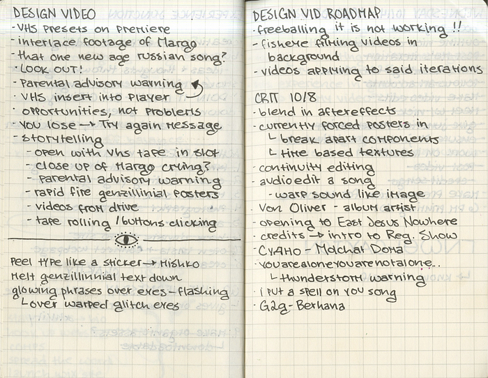
That is until I unlocked the realm of After Effects, by far my least utilized Adobe program. I was tentative and choppy at first, but once I grew to understand the basics, I took off like a horse out of the gate. I became addicted to creating short clips that showed my stagnant compositions as trippy, melting, oscillating pools of color and dimension. Those visuals paired with a retro VHS effect and static-filled snippets of songs and conversations came together to create the final cut of my video. Hindsight 20/20 (pun most definitely intended), this was one of my favorite processes and final products of my collegiate career.

Greg Process
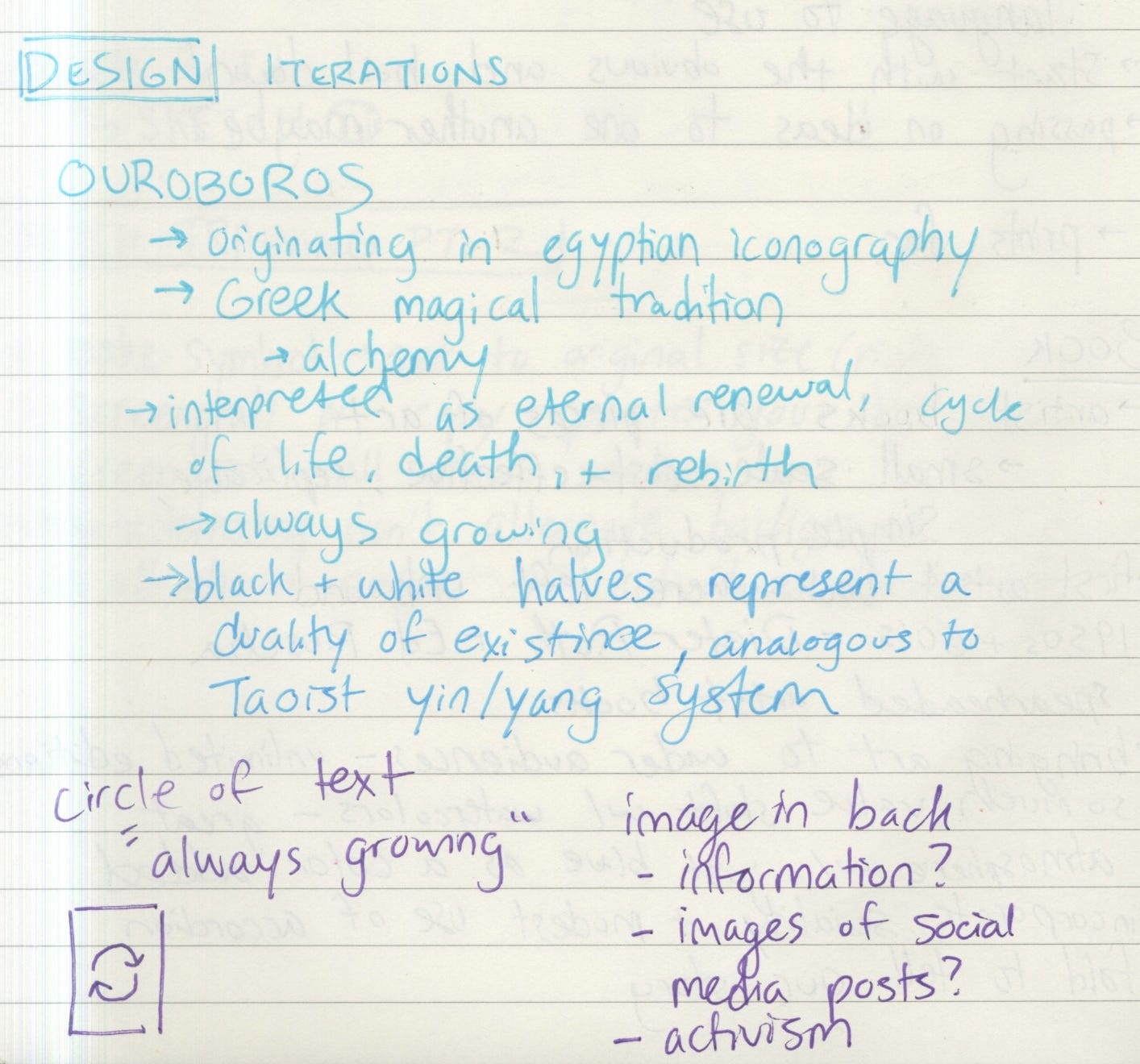
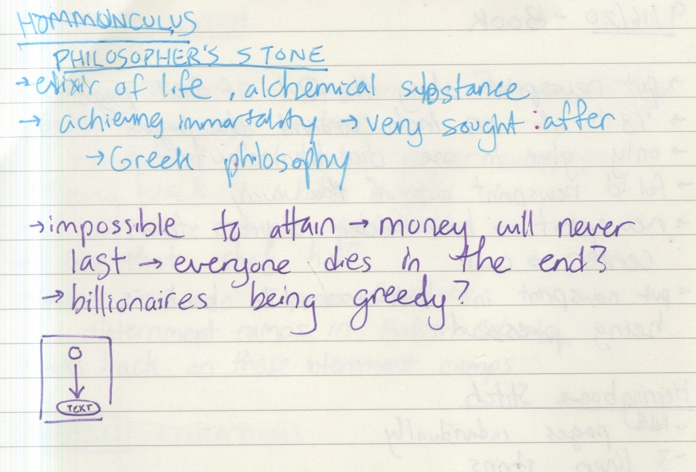
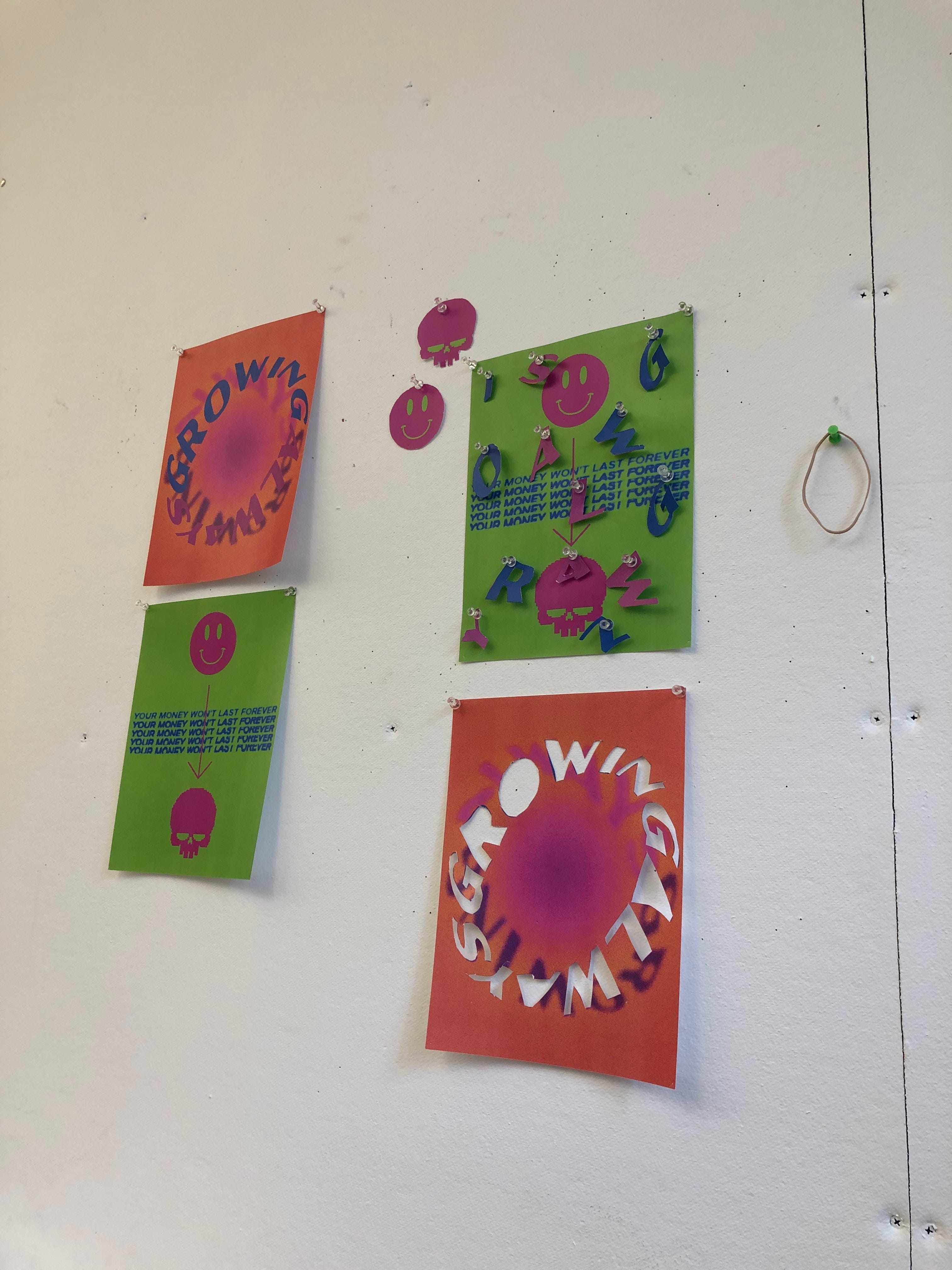
After our PechaKucha presentation, I dove into a bit of research before my iteration process. A little inspired by Fullmetal Alchemist, an anime I watched over the summer (you should watch it if you have a chance, it’s super good!), I wanted to make my first iterations derived from the Ouroboros and the Philosopher’s Stone. The symbol of the Ouroboros represents not only eternal life, but the idea of constant growing, of infinity. Similarly, the Philosopher’s Stone is an object equivalent to the Elixir of Life — if successfully alchemized, man can attain immortality. These ideas resulted in my main iconography for the rest of the project, a mobius-strip-like phrase saying “ALWAYS GROWING,” and a smiley face with an arrow pointing to a skull.
In a following class, James showed us a number of designers in a virtual lecture. During this lecture, I got really invested in the clip of Nancy Skolos and Thomas Wedell, as I enjoyed how analogous and hands-on their iterative/design process is. Feeling inspired, I printed out multiple copies of my two iterations, and began ripping, cutting, and pinning pieces together to pump out more iterations. When I had a good amount of these collaged pieces photographed, I took them into Illustrator and began manipulating them virtually — pixelating, warping, inverting colors, and more. Through this process, I ended up with 25 heavily saturated iterations.
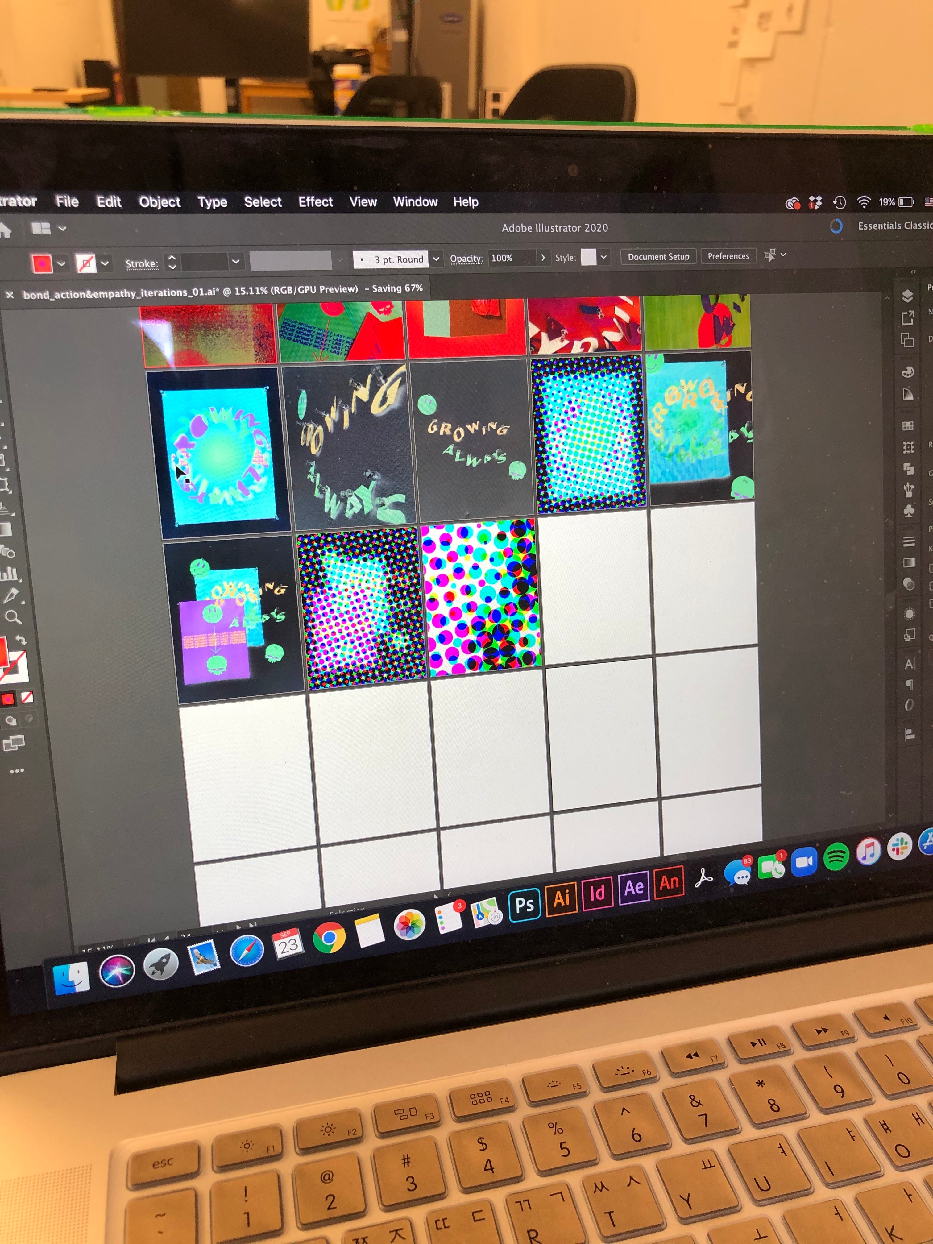
After presenting these to the class, I started to lean towards creating a video for my final project in order to keep my RGB colors vibrant and lively. My desire to create a video piece only strengthened once James showed us pieces from his time as a student. Specifically, his Sail/Fail video piece and his publication 13/13 both inspired me to work with projections and typography in my video. With newfound excitement, my group and I got to work.
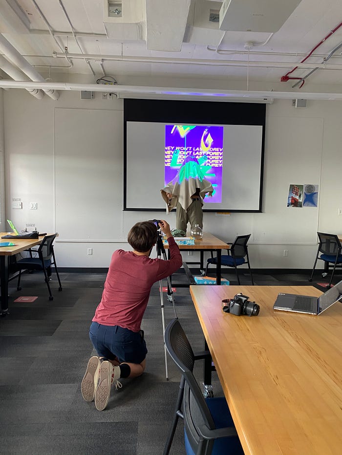
The next class period, we gathered materials and staged a projection film shoot. We went into Room 409 and hooked my computer up to the projector, displaying our vibrant iterations on the wall. I set up my Canon G7X Mark II and my tripod, and we began to film different materials waved around in the projected light, from blankets and plexiglass to glass vases and tissue paper. After this fun-filled class, I took my footage and began working in After Effects, clipping together shots and layering them with glitchy effects and elements from my first two iterations. I made around a 30-second video for my first draft, which was well-received by our classmates. However, once I spoke with James, we both agreed that the video needed more, and he suggested that I experiment with more projections and include a narrative component to drive the video along.
Thus, I went back to do some more research, digging deep into Aesop’s Fables to find a narrative that aligned with our idea of “Gen Zillenial”. After reading through most of the tales, I landed on “The Wolf & The Lamb,” a story about how the unjust will never listen to the reasoning of the innocent. Before diving back into After Effects, I also scheduled another film session, this time borrowing Kendall’s portable projector. I projected more iterations on the walls/objects of Room 405, and took both the footage and fable into my project.
I ended up having a lot of fun with this second draft, utilizing the blending styles of After Effects to layer video on top of video, creating a chaotic and overwhelming experience for the viewer. In terms of audio, I recorded myself narrating the fable, and edited the track in Garageband to distort my voice a bit. Lena also showed me a great (but sketchy) website called freesound.org where I found a bunch of distorted audio clips that fit well with my video. I also screen recorded my computer screen typing out certain phrases from the fable, and multiplied these videos into my AE file to give another layer of narration to the project.
Eme Process
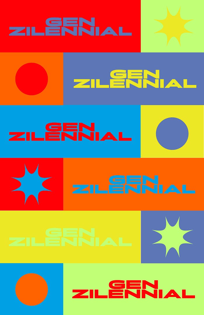
When I was trying to brainstorm issues that were really impactful and personal to me to focus on for the project, I was honestly overwhelmed. I condensed my ideas down to 3 main ones (fighting racism by diversifying representation in the media — especially more positive Arab-American representation, supporting and advocating for survivors of sexual assault, and climate justice) but there were way too many for me to pick just 3. As I talked to Kendall about the issues that were important to her, like mental health de-stigmatization, I noticed that we had a lot of overlap in the things that we were passionate about fixing, and that most of them were common worries of most of our friends and peers our age. I realized that our generation is shouldering so many issues that have been passed down to us from past generations, and that right now, most of these things are reaching a boiling point. We have under a decade to make major changes to combat global warming before we hit the point of no return. Our president is racist and sexist and leads by example, and we can see the effects of his term in office through police brutality, rampant racism, discrimination against the LGBTQ+ community, and jeopardization of reproductive rights. It’s overwhelming, we don’t feel ready to tackle these problems, and we’re growing up way too fast, but we don’t have a choice.

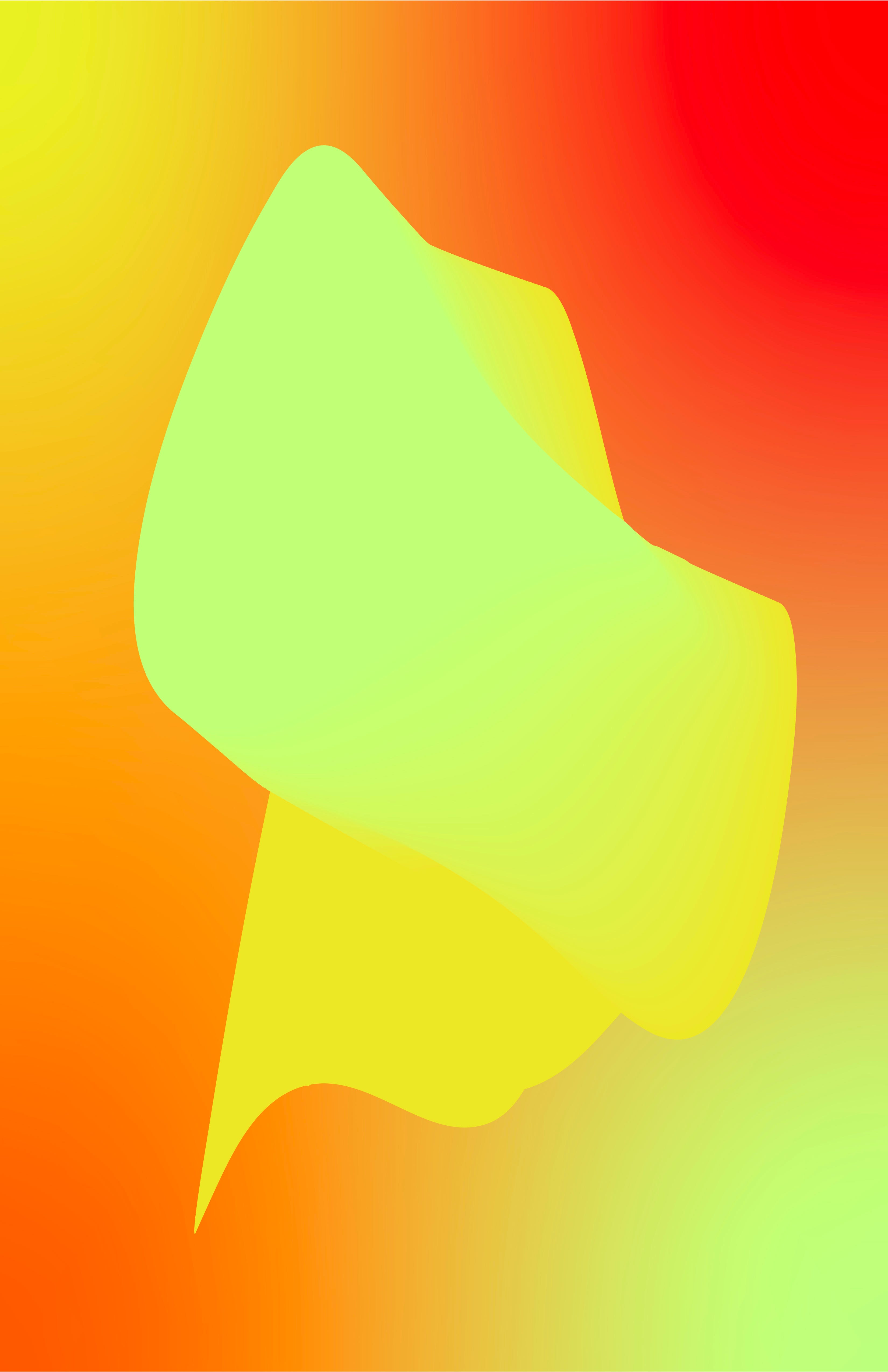
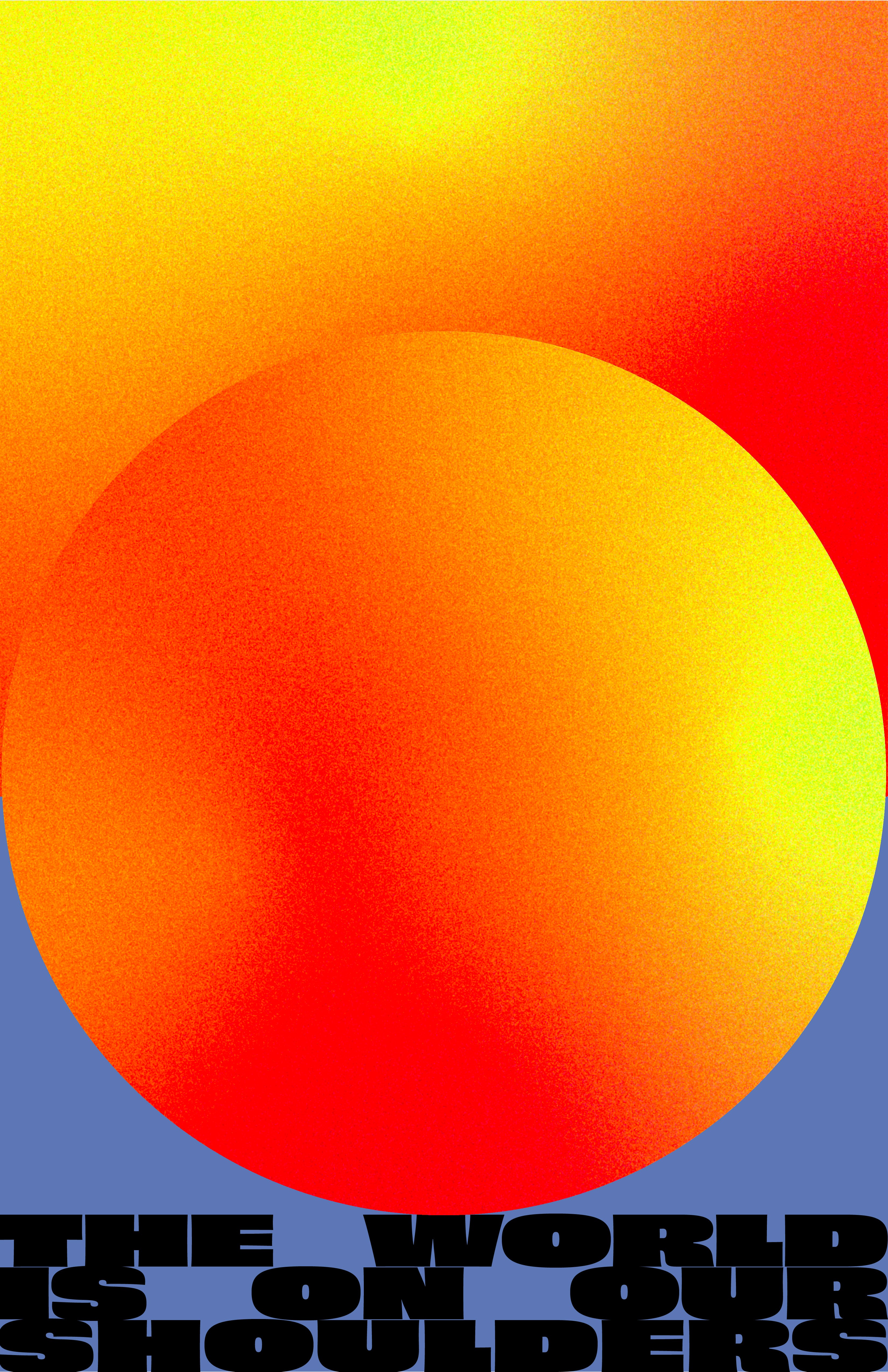

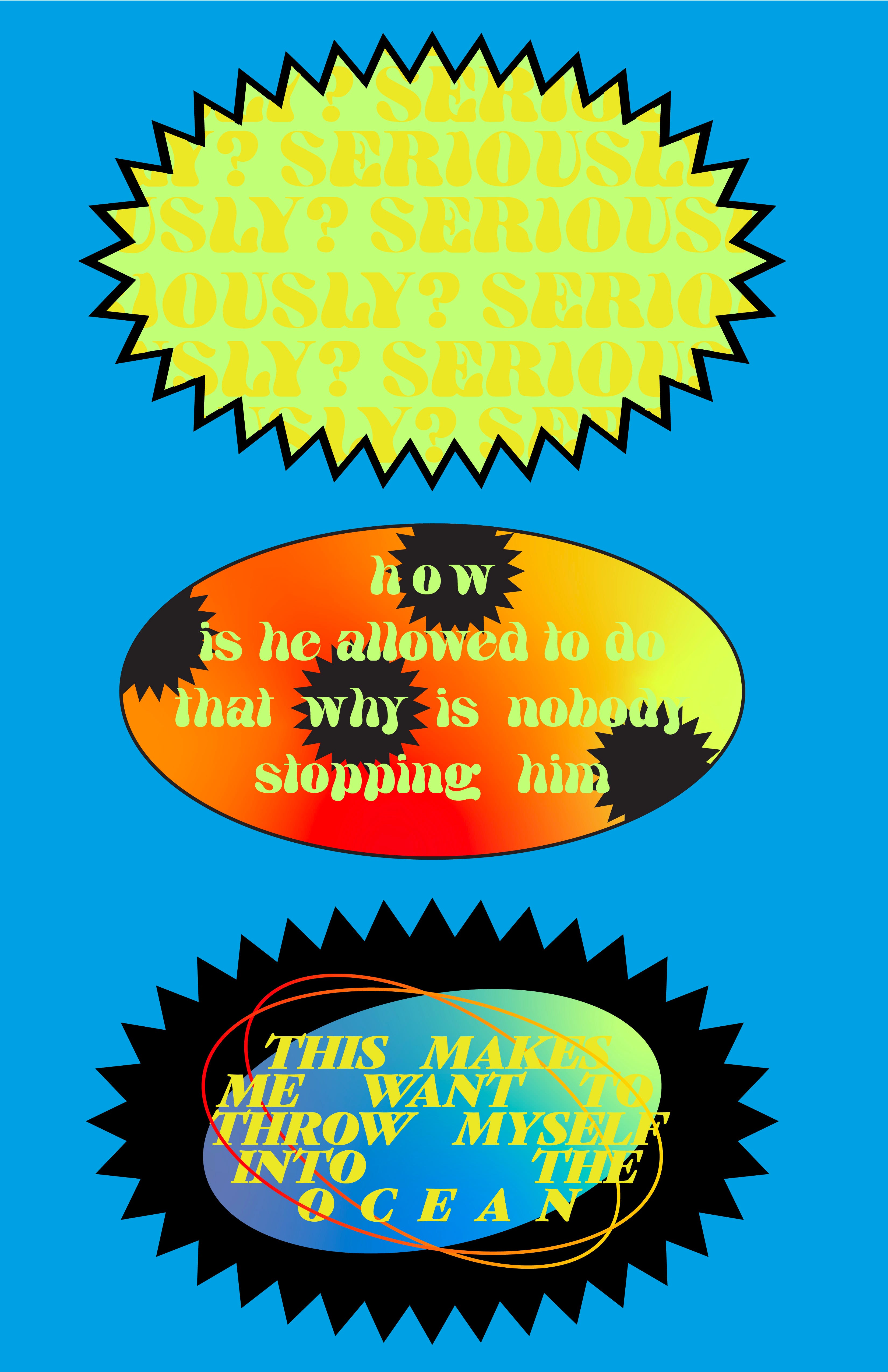
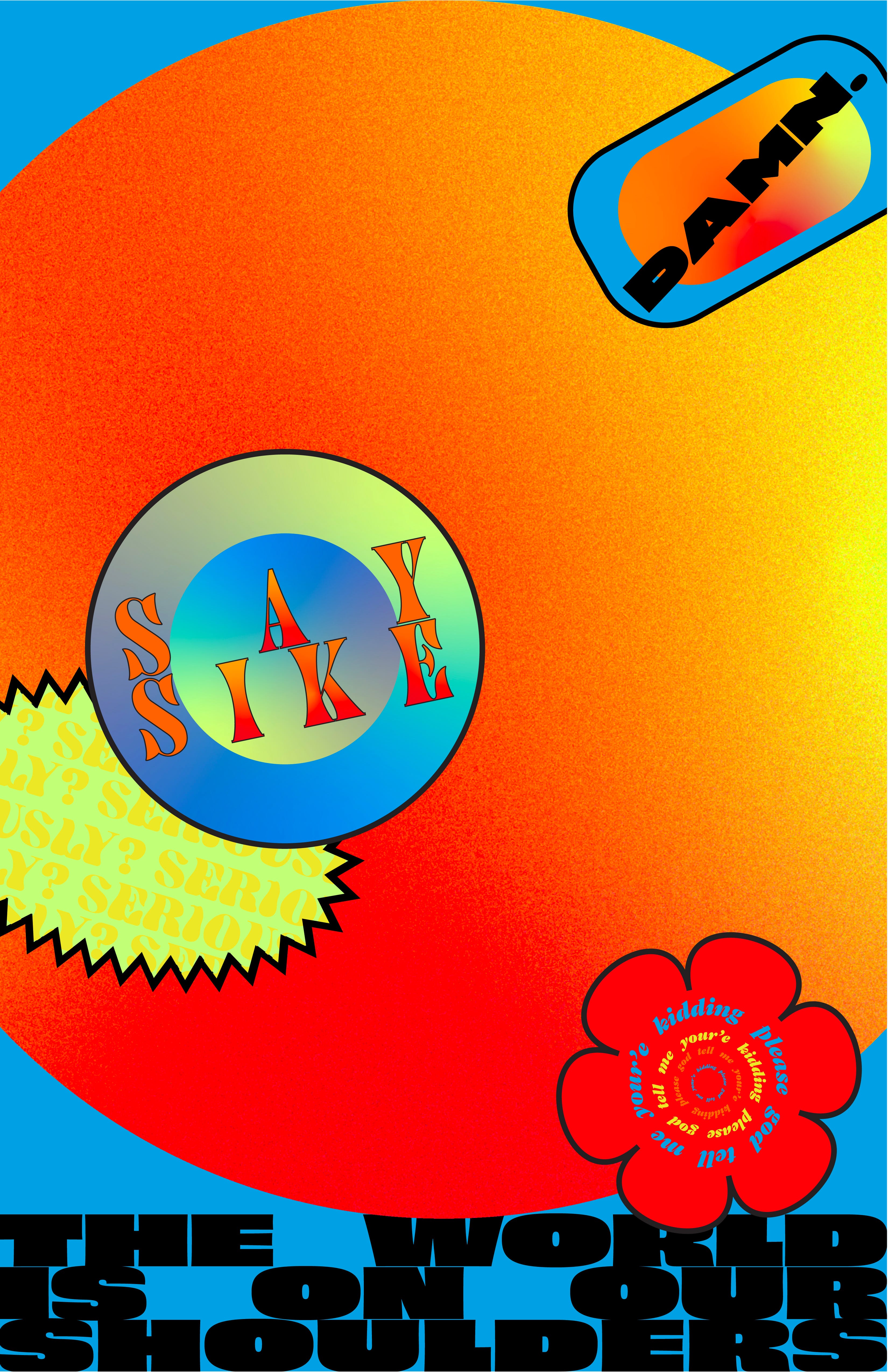
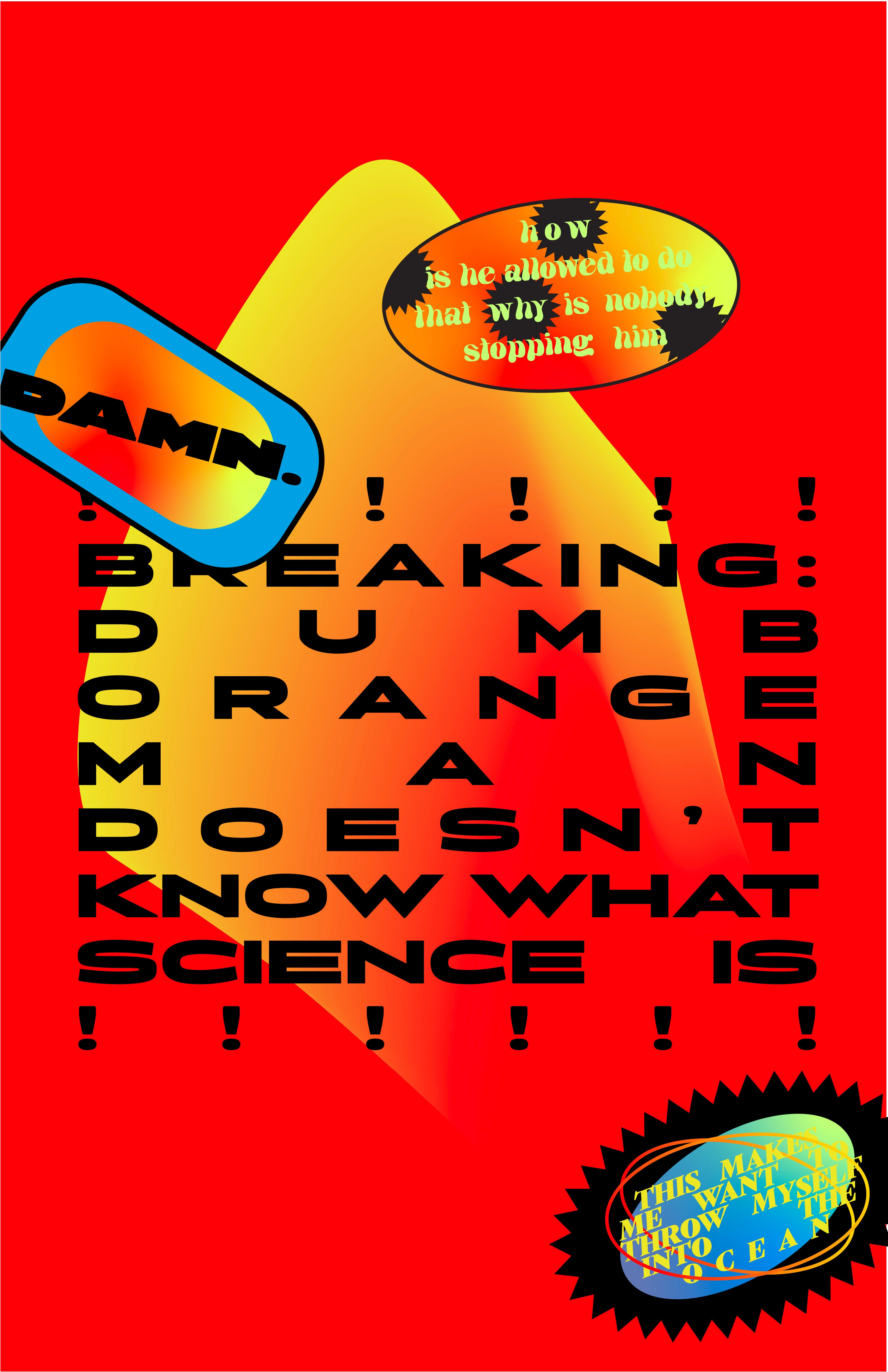
Using that as a jumping off point, I wanted to really capture how jarring and stressful being a gen zilennial (that weird space between gen z and millennial) is — we’re under constant pressure to fix the world, but we’re barely old enough to vote. My initial iterations were mainly color play, trying to find a balance between aggressive and pleasant in my palettes. I used those colors to start making abstract forms and experimenting with gradients and grain — I wanted to express the frustration and pressure our generation feels without being scary or incomprehensible, and staying relatively relatable to a wide audience. From there I started to bring in some type and settled on Briller, a heavy extended typeface with a lot of weight and density, to drive home the idea of a crushing weight on our shoulders. I also wanted to experiment with different vehicles of conveying urgent messages, like calls to action or notices, and played with some expressive containers for my type. I started out by making some sticker designs with some pretty intense contrast and gradients meshing with aggressive and overcrowded type and patterns. From there I reigned it back in and used gradients and those type containers to convey a message that I wish I could tell everyone in our entire generation — we are not alone.

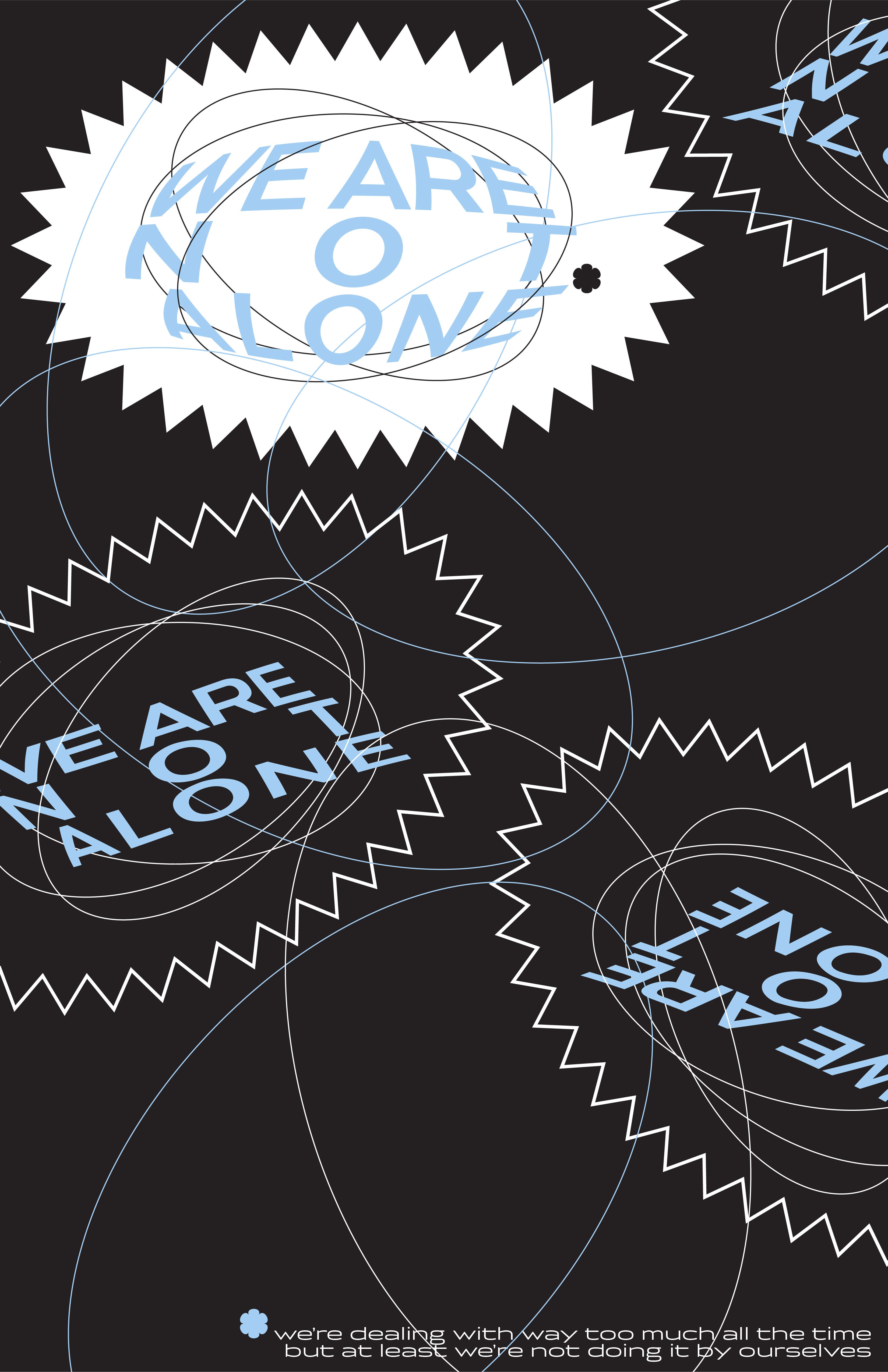

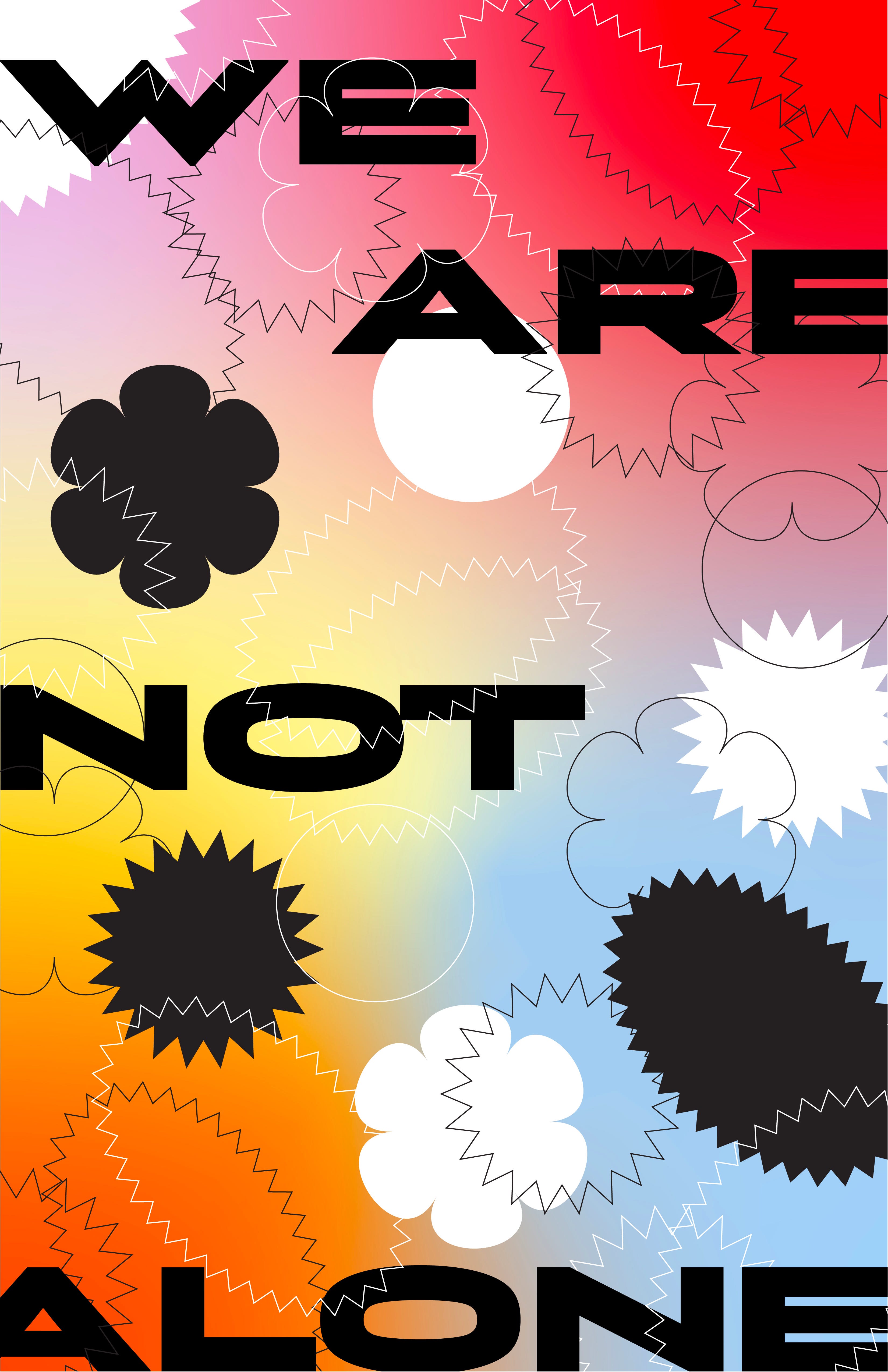
Initially I wanted to make a series of riso broadsides that each explored one of the stressors facing gen zillennials today, but after talking to James, I realized that our current riso ink options just didn’t match up with my color palette. He also mentioned that the last 5–6 of my iterations read like animation stills, so he pushed me to think more in the realm of motion graphics for my final. I basically had to teach myself AfterEffects and the process wasn’t exactly quick or painless, and I did a few short experimental animations just to figure out the program. After wrestling with it for a couple weeks, and the help of lots of youtube tutorials, I created an animation that sends a message to anyone in our generation who needs it — we’re all stuck on this roller coaster together, and we’ll deal with it together, but we have to do our part to contribute. Ultimately, I aimed to create an animation that feels topical and relatable to gen zilennials, validates our struggles, and serves as a call to action, but also conveys our overwhelming responsibilities in today’s society and how crushing, chaotic, and anxiety-inducing they can be.
Kendall Process
At the beginning of our iterations, I had a super concrete idea in my head of what I wanted this project to look like. I could envision an online portal that connected people to information and knowledge about what gen-zillenials are going through, and I was dead set on this idea down to the color palette. Once I met with the rest of my group and we showed each other our iterations, I realized that there were so many other paths to explore. I saw Greg’s work with bright colors and grain, Lena’s contrasting forms and warped type, and Eme’s color palette. I realized that we could do a lot more exploring and experimentation and potentially find something even more interesting.
In the next round of iterations, I found myself experimenting with a ton of bright colors and geometric forms, but was the most interested in some of the narrative elements I had started exploring. I had made a series of social justice stickers in the first round of iterations, and ran with that form to create more physical paraphernalia that worked with our theme. I ended up with a series of 2020 admission branding, in the form of wristbands, VIP badges, and a board game path accompanied by a 2020 themed wheel of fortune. This is where I really honed in on the idea that would carry itself throughout the rest of the project: the concept of 2020 being an absurd, unbelievable, and outrageous year that can’t be defined in black and white.
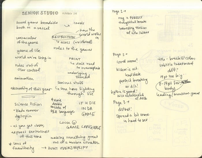
In our discussion with James on October 1st, we talked about the idea of restriction and access, and how that functions with the vernacular of a board game. We discussed how this lens of familiarity could provide the perfect way to look at the absurdity of this year and time in our lives. The rules are out of our control, and we’re desperately trying to pave our own way through the madness and make sense of it all. With this newfound inspiration, I embarked on making some new iterations, but surprisingly found myself very stuck. It wasn’t until our next check-in with James, one week before the final project was due, that I had a breakthrough.
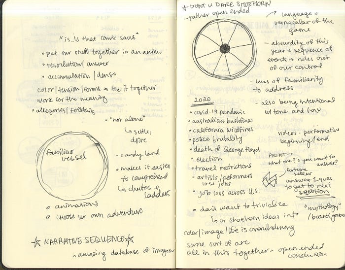
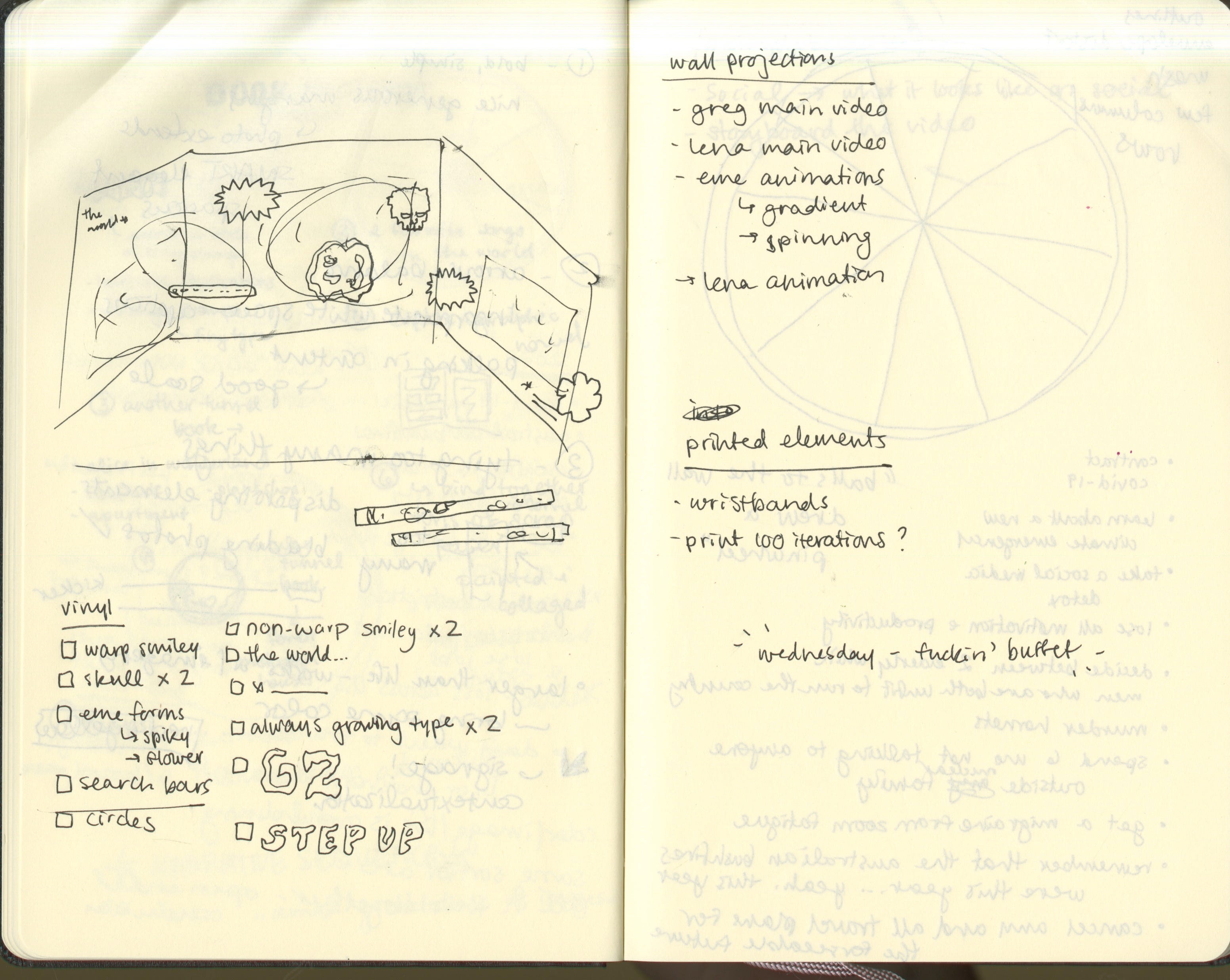
During that check-in, I came to the table with the honest confession that I was deeply stuck. In the next few minutes, just by talking it out and describing where I wished my iterations could go, I was struck with the idea of an installation. I told the group to forgive what would probably sound like the rantings of an insane person, as I described the idea that hit me on the spot: a black box room filled with projections of Greg, Lena, and Eme’s video content, in which my board game and branding vernacular serves as a form of navigation and wayfinding throughout all the madness. My thought was that it could be a physical representation of what it feels like to be a “gen-zillenial”. Overwhelming, overstimulating, needing constant attention, unsettling and disorienting, and makes you feel small. Here’s a little snippet of my notes from this meeting, because I feel like they show exactly how my brain came to this final plan:
Narrative — own personal take
Installation — wristbands/board games come together
Interesting branding components
Struggling with sequence
-documentation of installation
Wayfinding !!!!
From the entrance of 808 — brings you to the studio
Multiple screens — reflecting the experience we’re all living right now
Room 411
Document this space, this feeling
Suffocating, engulfing, overstimulating, but you feel like you have an obligation to pay attention to everything
Performative aspect to find out what the final piece is
Risk — setting all these things up, seeing what happens
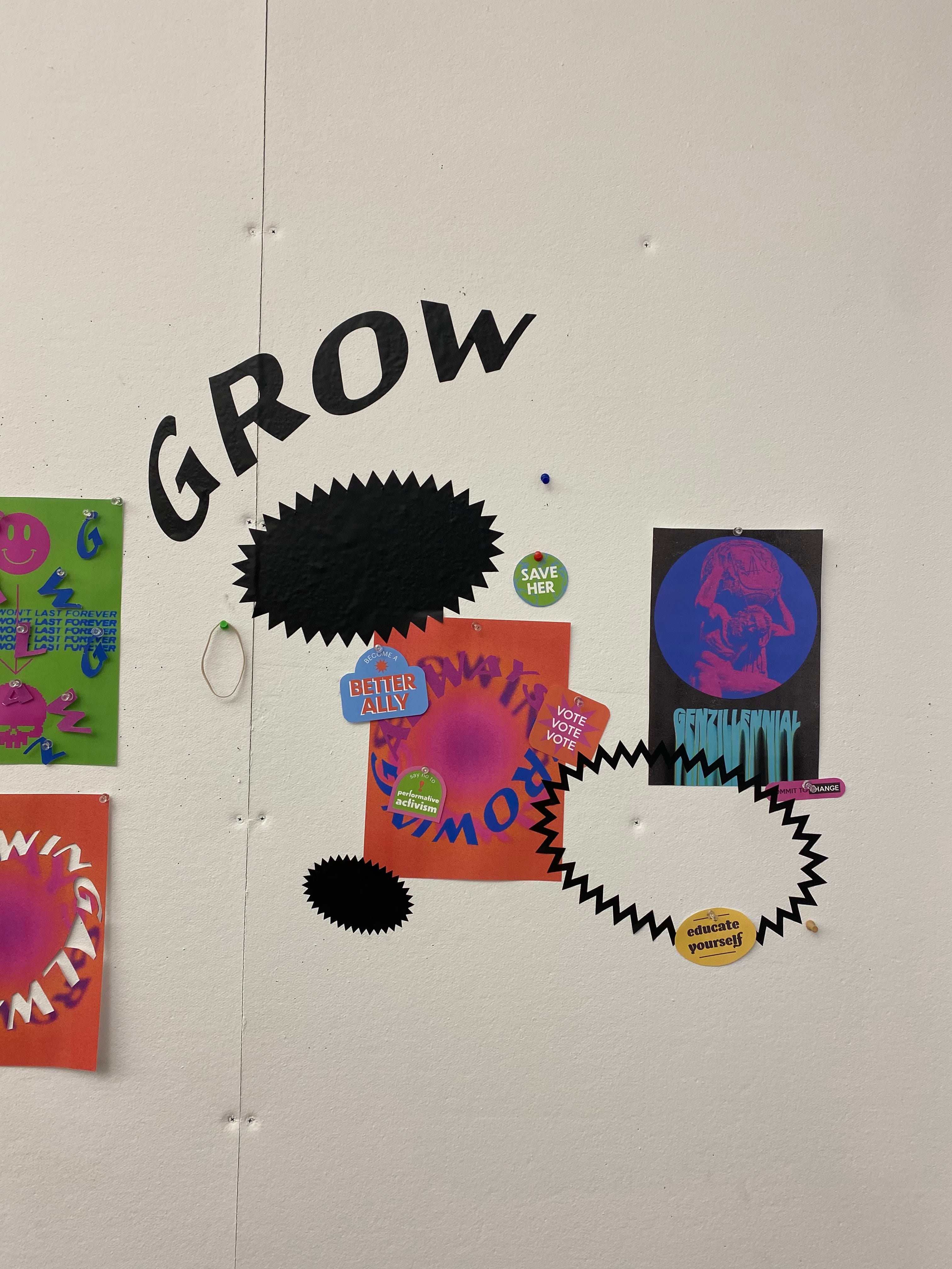
This is where my brain took off, and I called Lena afterwards to describe to her how perfect I thought this installation could be as a way to showcase our materials while paying homage to our concept and creating a super interesting space to document. I got super excited about it, and came up with ideas about vinyl cut elements annotating the projections, wristbands necessary for entry, and a couple other ideas that never made it to the final room (printing Eme’s reactionary stickers for viewers to use to interact with the content, creating a board game path that you physically follow through the room). I went back into our iterations and found all of the forms from each of us that I thought could enhance the video content, and set out to vinyl cut those on Wednesday. After a lot of trouble from the vinyl cutter (and a move over to 855 after Brandon was stumped by an Illustrator glitch on the vinyl cutting computer in 808), we finally had an array of large and small forms from each of our iterations: type, geometric forms, skulls, smiley faces, etc. Once we had these done, we dove into the installation and the rest is history.
Installation
With a week left of the Action & Empathy project, our group met with James once again to show him our progress on our final drafts. We had all done some exploring in different directions, and Greg, Eme, and Lena had developed video clips that were evolving into more fleshed-out pieces. Kendall was still struggling with where to take her iterations, thinking about ways they could work through print or small animations, but not wanting to make a full video. As we each talked about our current positions in the process, Kendall realized that she might be able to use her iterations to tie everything together. She brought up the idea that, in a perfect world, it would be interesting to see how these videos work together in the form of a projected installation in a black box room, with her narrative elements (wristbands, board game components, search bars) tying it all together.
As we thought more about this idea, we realized how much the concept of an installation fit in with the core of our project. It would function as a physical representation of what it feels like to be a “gen-zillenial”; overwhelming, overstimulating, enveloping, exciting at times but also disorienting and scary. We realized that with an installation, we could play with so many of the forms we created, through the layering of vinyl, projections, and sound. We got super excited about it, and started planning what it would look like. In Lena’s words, we decided to come in on Wednesday night with “a fucking buffet” of content and physical pieces to take over the space.
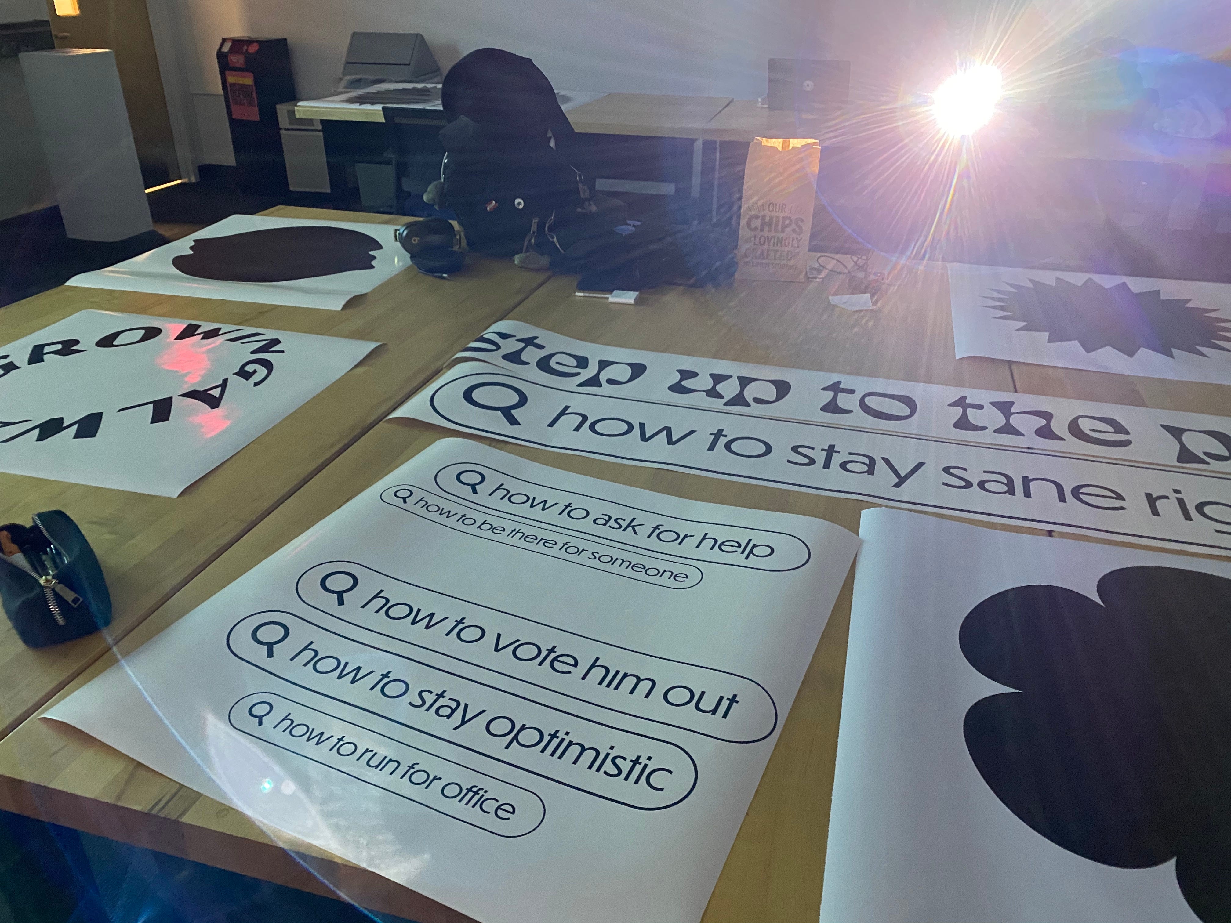


Come that evening, we were ready to start installing our installation. Eme, Greg, and Lena had all finalized their videos the night prior. Lena took charge renting the multiple projectors we needed from the SVA office, and Kendall brought two more that she borrowed from her roommates. Our group thought it was best to split up our tasks, so Lena and Eme began testing and placing the projectors in Room 411, while Kendall and Greg headed over to 855 to print the vinyl and wristbands needed for the installation. Once complete, our members regrouped, and we got to installing the vinyl. We did our best to create a good pacing between our projected videos, which resided on the four walls of 411, in addition to the ceiling. For Lena and Greg’s audio components, we ended up using Kendall & Lena’s JBL Flip 5 and JBL Clip 2, respectively. Installing the vinyl took the better half of the night, but in the end, we’re extremely proud of the installation we created! And without further ado, here’s a video of our final project :)
