It took me a while to land on an idea for our second Motion Graphics project, Tender Buttons. Towards the beginning of the process, I was super stumped on what to make. Initially thinking I would create a hand-drawn, frame-by-frame animation, I came a long way to my final draft––a video working with multiple methods of hand-made (ish!) typography.
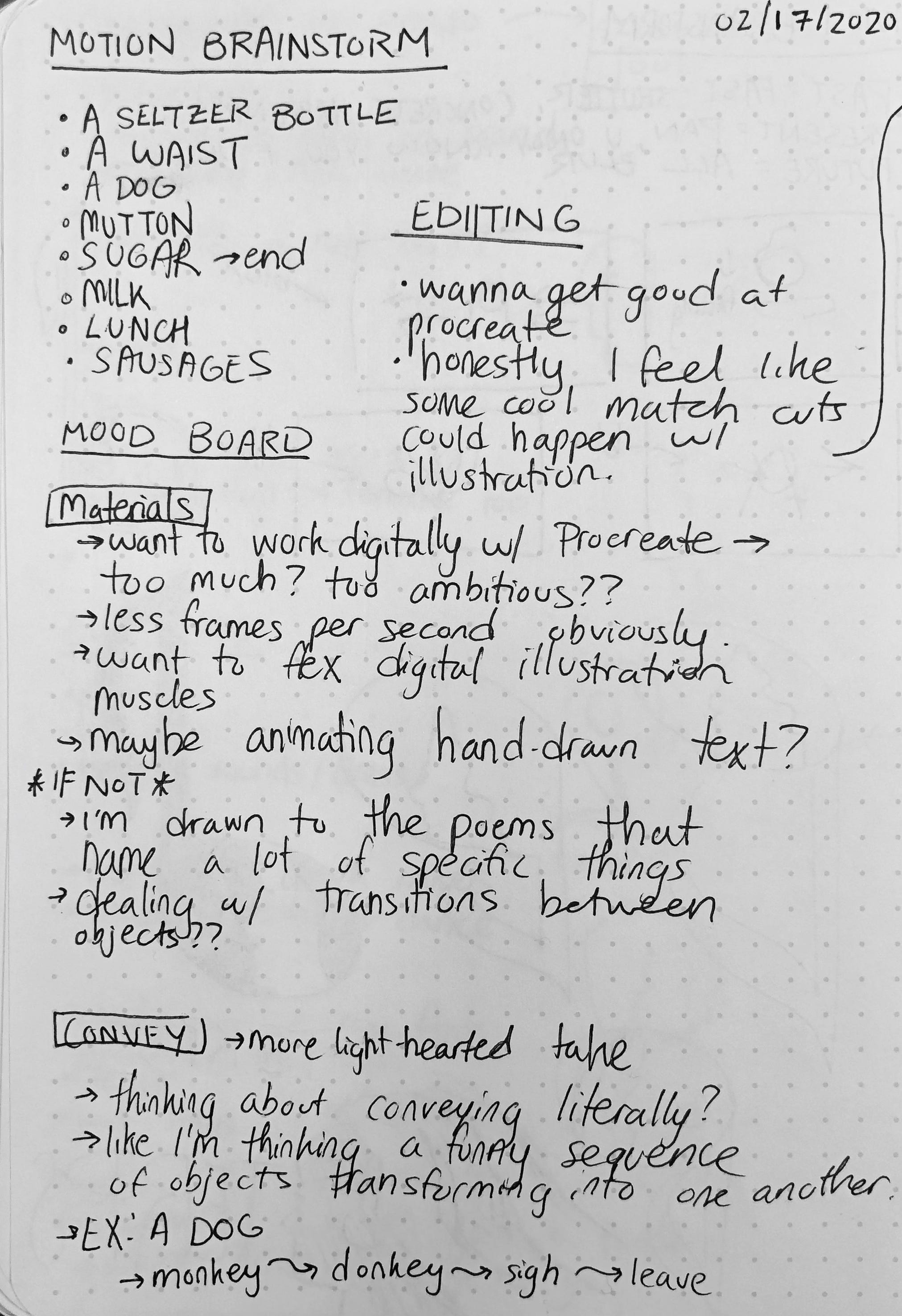
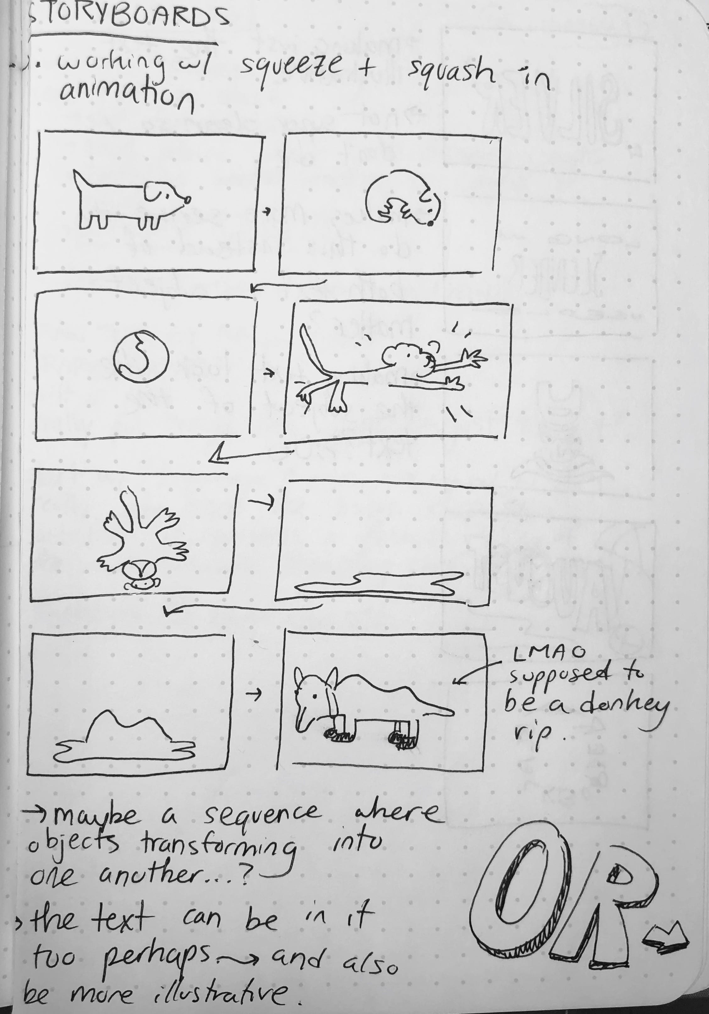

Like most of my projects, I started Tender Buttons with a classic brainstorming session. First, I read through Gertrude Stein’s poem, and picked the passages that spoke to me most. I thought a lot about what I wanted to convey––emphasizing the fun, nonsensical language in Stein’s poetry. I also wrote down my initial goals for the project: getting better at Procreate on the iPad, and working on my animation skills. With these goals in mind, I storyboarded what I thought my Tender Buttons project would be, attempting to animate the subjects of Stein’s poem transforming into each other, or animating the key words from Stein’s poem in an expressive way.

This idea, however, did not last long. During my first meeting with James, I decided that hand-drawn animation would be a daunting task, and I went back to the drawing board. I felt really inspired by guest speaker Vaish Kumar’s take on the project, so I wanted to try my hand at working with my hands (haha) and making hand-made typography. Thus, my second idea was born. I storyboarded ways I could sew words and different materials together together, trying to emphasize Stein’s writing: a conglomeration of seemingly unrelated words. Spoilers––this second idea did not make the final cut; however, I started a draft of idea #2, posted below!
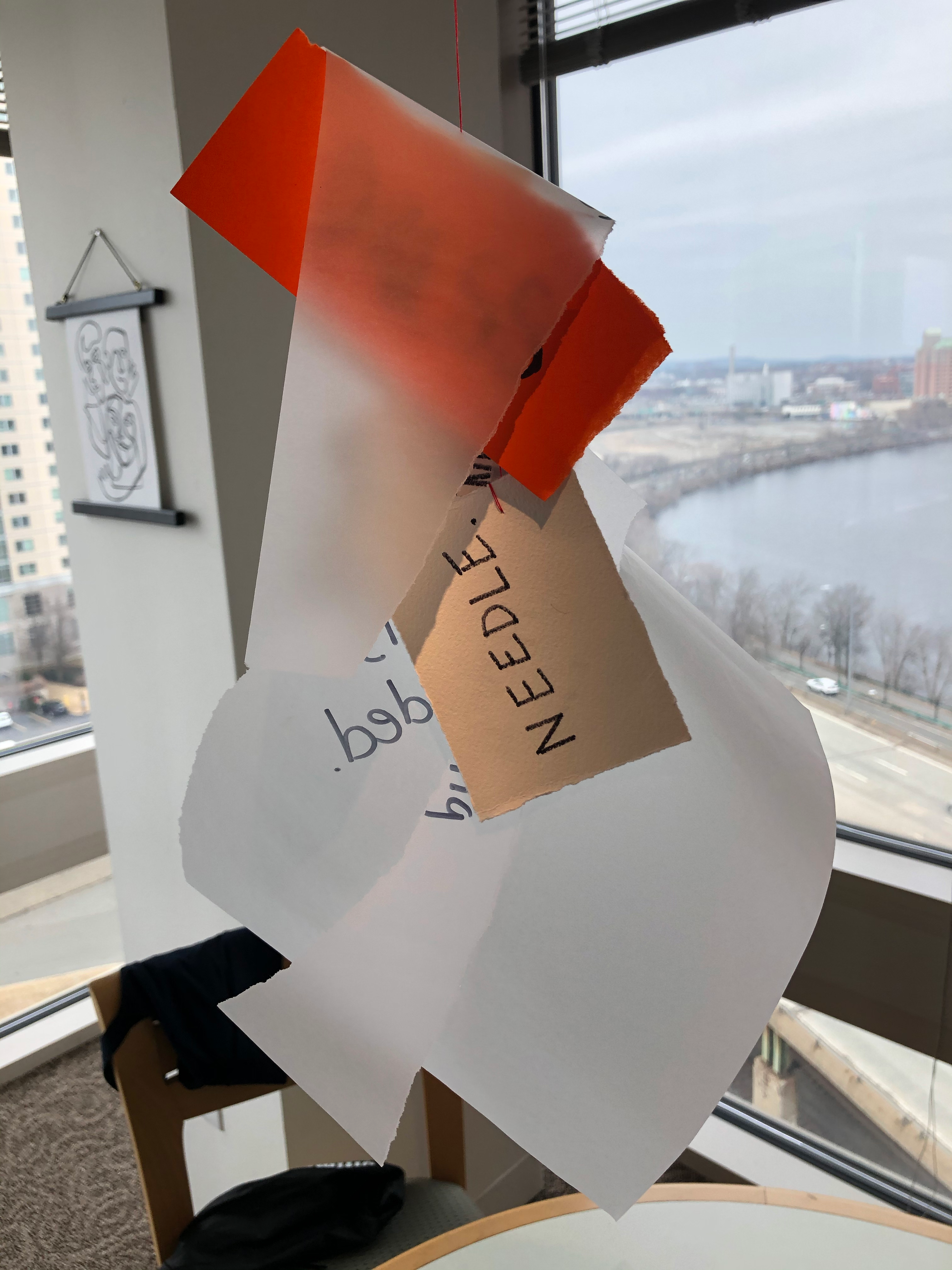


After meeting with James and Sophie once more, we decided that idea #2 wasn’t exactly there yet, but definitely held some potential. I wanted to learn and utilize the effects tools in After Effects, so together we brainstormed a bit more, landing on the idea of filming 5 different methods of creating hand-made type and splicing/layering them together with differing opacities.


Now on to the fun stuff: filming! I had a good time filming the creation of the typography for this project. Like last time, I used my Canon Powershot G7X Mark II, a big tripod, and a hand-held tripod to capture my footage. My final five methods of creating type were as follows: writing on window glass, writing by hand straight-on, using yarn & pushpins, tearing off pre-cut vinyl, and hooking my laptop up to my TV to type super large.
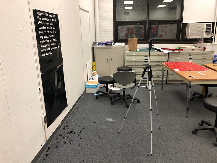
Each method definitely had its own fun parts and challenges. My favorite methods to create were probably peeling the vinyl, and writing on the window. I enjoyed the process of peeling in one long take, not knowing if what I was doing would work out in the end. Cons of working with vinyl: the letters are SO STICKY. I found them everywhere, on the floor, on ME, etc.
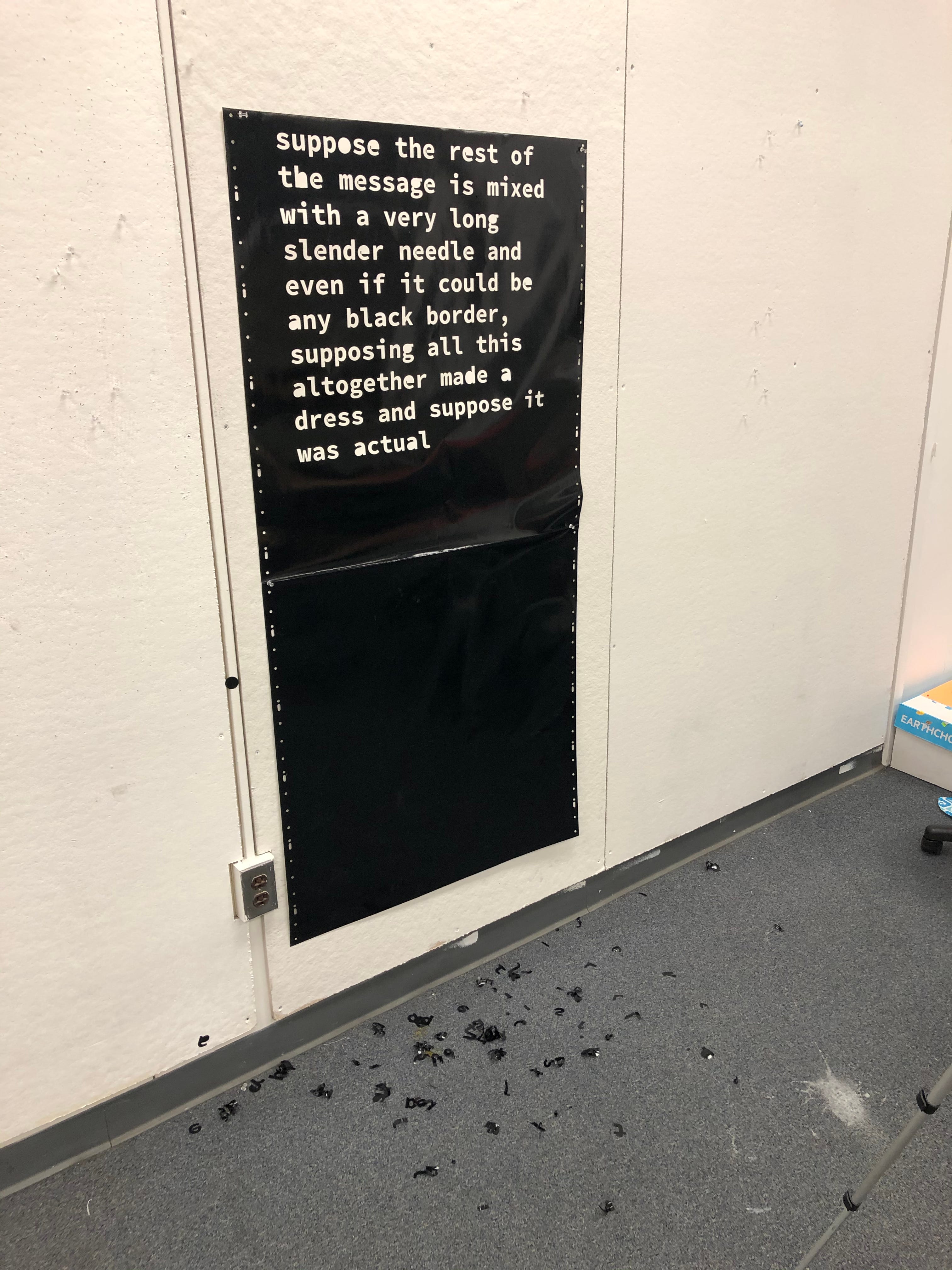
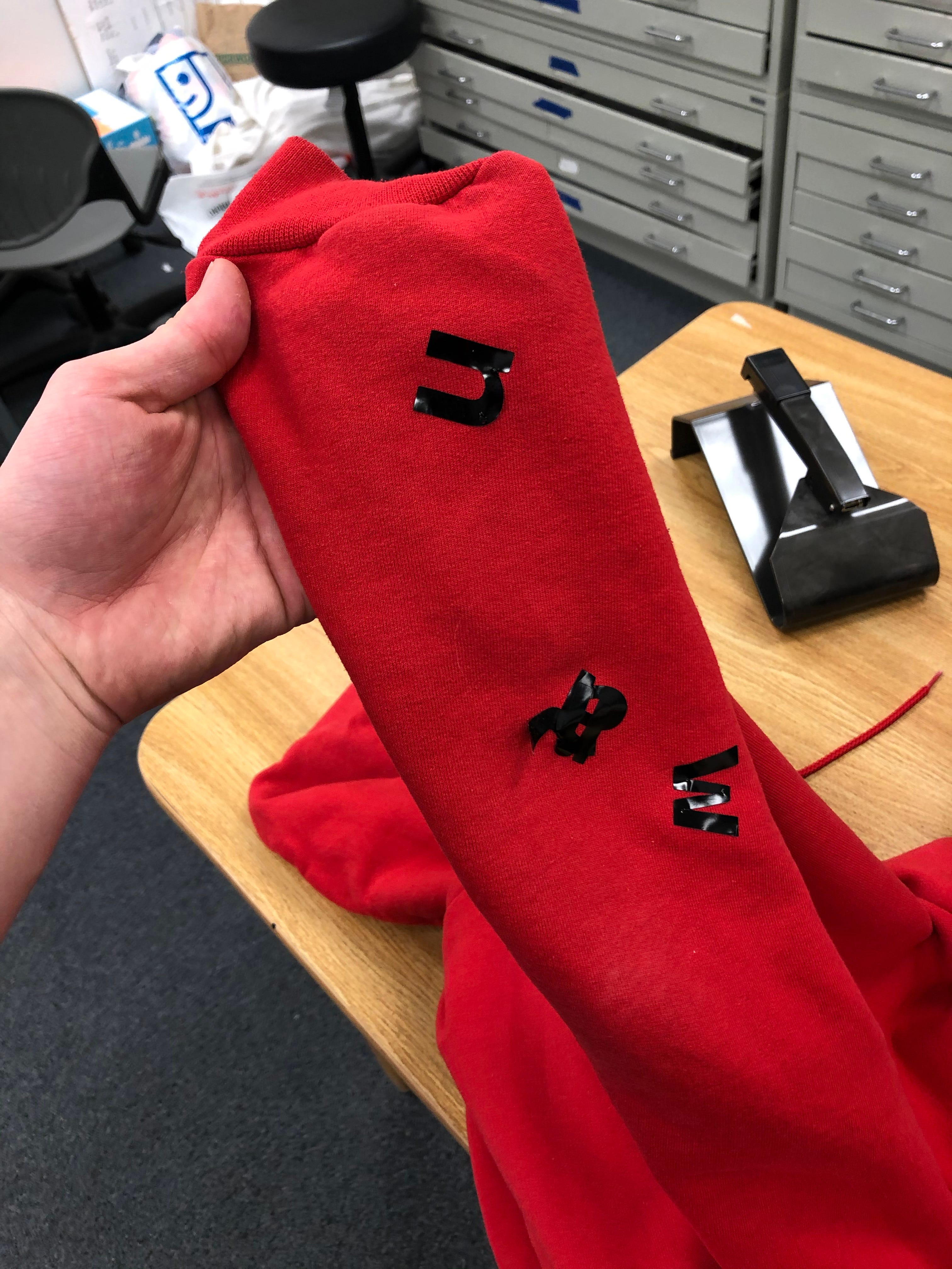

My set up for the window method was a lot more simple, I was reading the poem off my iPad as I wrote in Expo marker––a lot more easy to clean up then tiny vinyl letters. Working with the Expo marker was super interesting, as it was a partly cloudy day, so my handwriting was directly interacting with these beautiful cloud forms. If you watch my final video carefully, you can also see that the Expo ink spreads out for a second after you write, which I thought was a nice subtlety.
I also enjoyed problem-solving for filming the handwriting method straight on! For this footage, I was using my more malleable tripod, which is a lot smaller. I tried to wrap it around the higher part of my desk in Stuvi1; however, my camera was so heavy that it kept falling over in the process. So I looked around for something heavy, and once again, my trusty HydroFlask saved the day. I placed that as a weight on my tripod, and the rest of the process was smooth sailing. I enjoyed this handwriting stage, as I tried to assign different sized writing and colors to the words of Stein’s poem.


Although my ideas changed quite a bit, I’m really happy with my final version of Tender Buttons. I truly enjoyed the process of making this video, and definitely learned from the whole experience! I feel a lot more comfortable working with effect tools in After Effects, I learned how to use the vinyl cutter in 808, and I flexed my problem-solving brain muscles with this project quite often. Overall, I’m glad I landed on this final draft, and even though I’ve yet to make a hand-drawn animation in Motion, who knows what the next project has in store!
Lo and behold, here is my final draft for Tender Buttons!
